branding, website
Zeit Time Travel
Zeit Time Travel
Time Travel Tourism
CASE STUDY
project overview
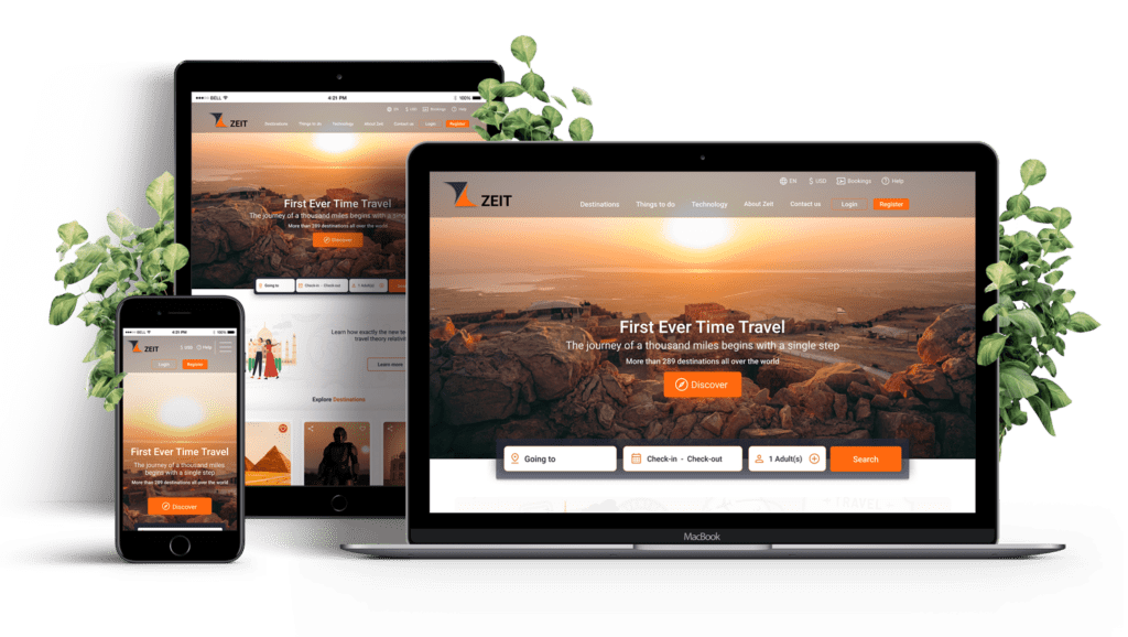
The human race has been dreaming about time travel for ages. Now it’s finally possible! Richard Branson’s Virgin empire offers a ZEIT first-time-ever time journey to the general public. Zeit is creating an e-commerce travel booking website that can sell time travel packages.
- Focus : UX/Visual Design
- Duration : 4 Weeks
- Role : Sole Designer
- Project Type : Student Project
- Tools : Figma, Miro, Adobe XD
Research
I began my research by understanding the need for a one-of-a-kind vacation travel experience. Time travel is significantly different than regular travel as the choice of destination, time, and add-on services determine the cost.
Goals
- Understand the current travel site, and travelers’ preferences
- Learn about time travel concerns
- Find which age groups are open to time travel
- Prioritize booking add-on services based on popularity
- Provide blogs and videos about time travel
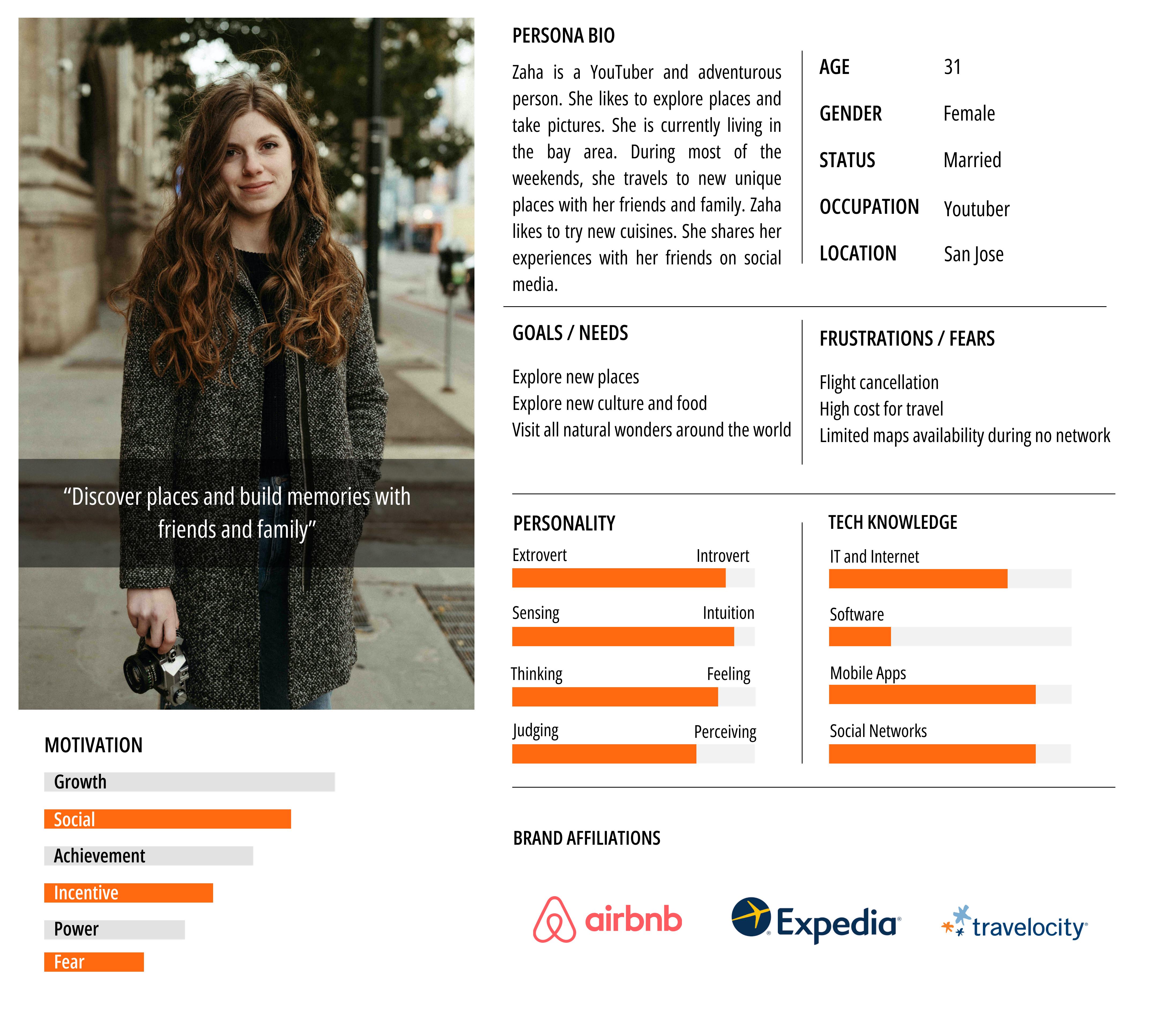
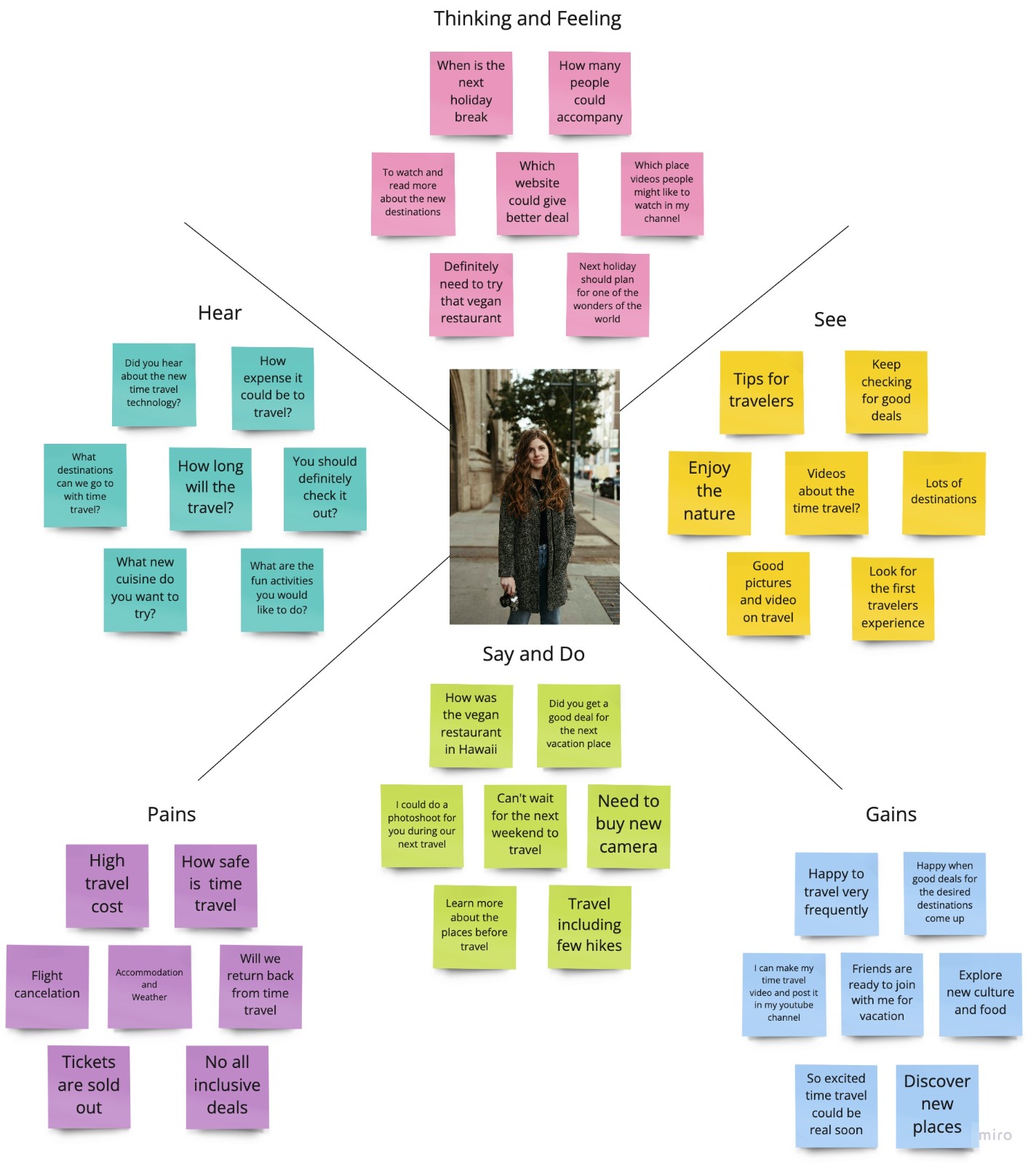
Since Time Travel is a unique concept, there aren’t any providers of this service. I looked into competitors providing travel services via air, land, and water. Additionally, I conducted a competitive analysis of similar products and came up with some brief provisional user personas based on the information discovered.
Methodologies
User Interviews
Everyone plans their vacation trip at least once a year. We will do a qualitative study to understand how users book their vacation travel. Long-distance travel that may require multiple stops and days of travel can be reduced significantly with time travel. We can learn about the travelers’ needs and destinations of time travel.
Focus Groups
Collect data and understand feasibility based on the information available from past reports. We can analyze the information and study further. The result can help us understand what the travelers’ expectations are and it will help us prioritize website development. And add additional features to be competitive in this travel booking space.
Survey
We can do a collective analysis of general travel and time travel for various popular destinations. Users get excited when they hear about time travel. They are curious to learn more about when time travel will be accomplished. Information collected from surveys can help us prioritize things like unique website features, popular destinations, and experiences.
Participants
As part of user research, we are looking people who are interested in time travel with certain criteria.
- Like to travel and explore new places
- Do online for booking instead of agents
- Travel for work
- Curious about time travel
- Travel bloggers, travel photographers
Assumptions/Risks
Since time travel is a unique experience unlike regular travel, we have taken into consideration a few assumptions and risks associated to this research. They are listed below:
- People may have trouble accepting new technology with time travel
- Travel’s safety. Any health impact? shorterm/longterm.
- Affordability. Is there a price range?
- Interplanetary travel or limited to Earth
Competitors Research
The secondary research is based on the competitive brands that include analysis based on customer service, ease of use, affordability, solution solving, technology, overall success, and feasibility. Even though the concept of time travel is new to travelers, these facts could help to build a user-friendly and qualitative/quantitative website.

STRENGTHS
- It’s affordable
- Gives unique destination experiences to stay
- It’s easy to use
- Good user interface and visual hierarchy
WEAKNESSES
- Don’t have a flight booking option
- Don’t have travel packages
- Limited options for destinations

STRENGTHS
- They have a plan for SpaceTourism
- They have reusable rocket technology
- They do all their research, development, testing, and fabrication in-house
- Very little competition
WEAKNESSES
- Cost a lot of money to operate products and
experiments - Still working on developing new and
innovative travel strategies - It is still in the early stages of its development
- Certain experiments have not performed as
well as planned

STRENGTHS
- Help in research and booking of flights,
hotels, and car rentals - They notify users when there is a deal
- Vacation/Travel package options
- Easy to use
WEAKNESSES
- Limited flight options
- Travel availability including flights is strongly dependent on their relationship with travel suppliers/aggregators

STRENGTHS
- Allow space flight booking
- Strong research and development team
- The crew escape system for safely measures
WEAKNESSES
- Lack of physical resources
- Lack of critical talent

STRENGTHS
- Visual and user hierarchy is maintained on the website
- World’s first commercial spaceline
- Good development team
- Innovation in space travel
- The user can get notifications on the latest updates
- Training program for mind and body travel
in spaceflight
WEAKNESSES
- Still working on the innovation
- No bookings available
- Flights cost is very expensive
While there are no direct competitors for Zeit, based on its business model, there are plenty of indirect competitors in similar travel space. Once time travel becomes mainstream, the indirect competitors can extend their website services by offering time travel to everyone.
Define
We are looking people who are interested in time travel with certain criteria such as those who like to explore new places, including travel bloggers and travel photographers. Those who are curious about time travel and would like to do so for work/business may add value to my research.
Number of Participants: 3
Interview Duration: 30 – 45 mins
Goal: To learn and understand how travelers book their travel
Research Debrief
Observations | Participant 1
Age: 32 Occupation: Youtuber | Participant 2
Age: 37 Occupation: Traveler/Blogger | Participant 3
Age: 41 Occupation: Sales Engineer |
Frequent traveler | Travels monthly twice | Almost every weekend | Travels frequently for work |
Travel experiences | Enjoy exploring new places and love photography | Explores hidden places, food, and photography | Have to travel domestic and internationally |
Booking online | Always book online and through agent | Sometimes online or drive | Anytime online booking |
Cost-conscious | Look for deals on stay and travel | Stay updated on deals for new places and stay | Sometimes can't look for deals as the travel plans are last minute but encouged to check for deals |
Open to new technology | Try to use new technology but thrilled to hear about time travel | Welcomes new technology indeed looking forward for time travel | Likes to try new technology |
Willing to time travel | Based on the time travellers feedback would like to travel in the future | Once the online booking starts likes to travel | Maybe in the future likes to time travel |
Research Insights
The secondary research is based on the competitive brands that include analysis based on customer service, ease of use, affordability, solution solving, technology, overall success, and feasibility. While the concept of time travel is new to travelers, these facts could help to build a user-friendly website.
There are no direct competitors for Zeit, based on its business model, there are plenty of indirect competitors in similar travel space. Once time travel becomes mainstream, the indirect competitors can extend their website services by offering time travel to everyone.
Feature Roadmap
Must Have
- Booking trip
- User register
- Safety
- Recent travel reviews
- Payment process
- Destination
- Cancelation policy
- Service and support
- About us
Nice to have
- Suggest destination
- Social media
- Video and pictures
- Newsletter subscription
- Reviews
- Share
Surprising and delightful
- Rewards and discounts
- Animation videos
- Guided tours
- Chat
Can come later
- New destinations
- Multilanguage
Card Sorting
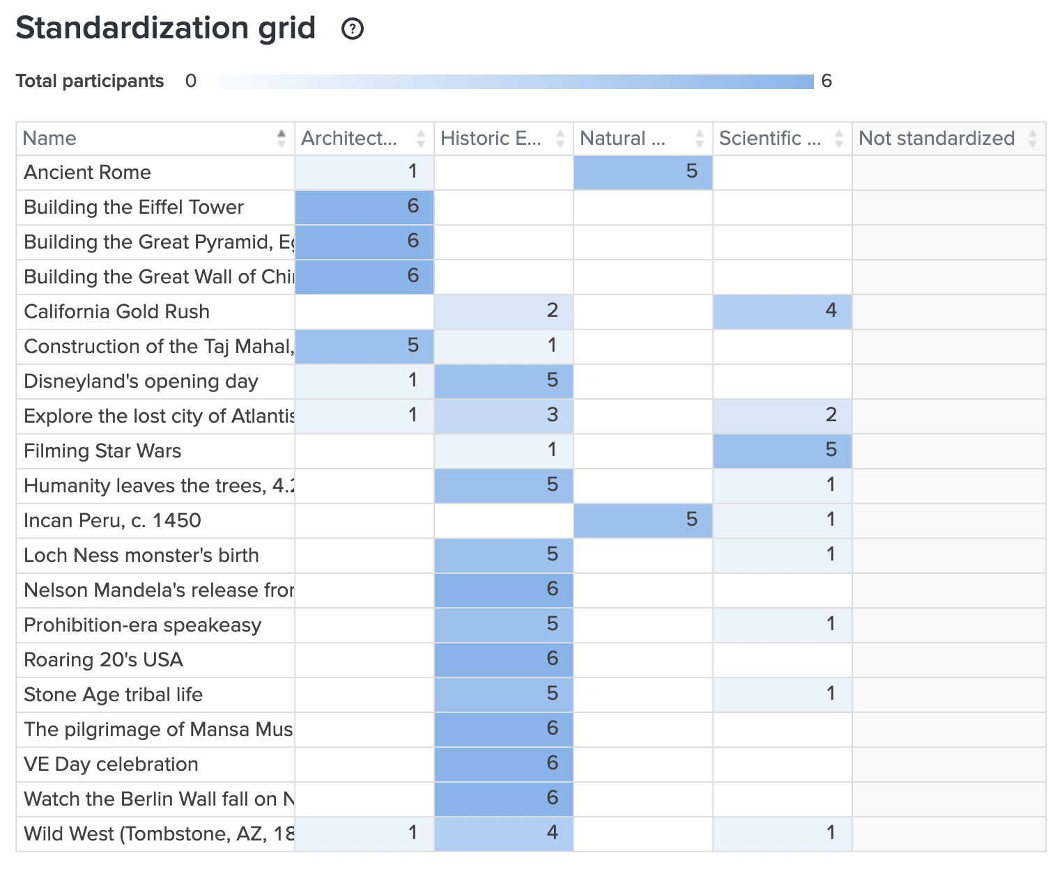
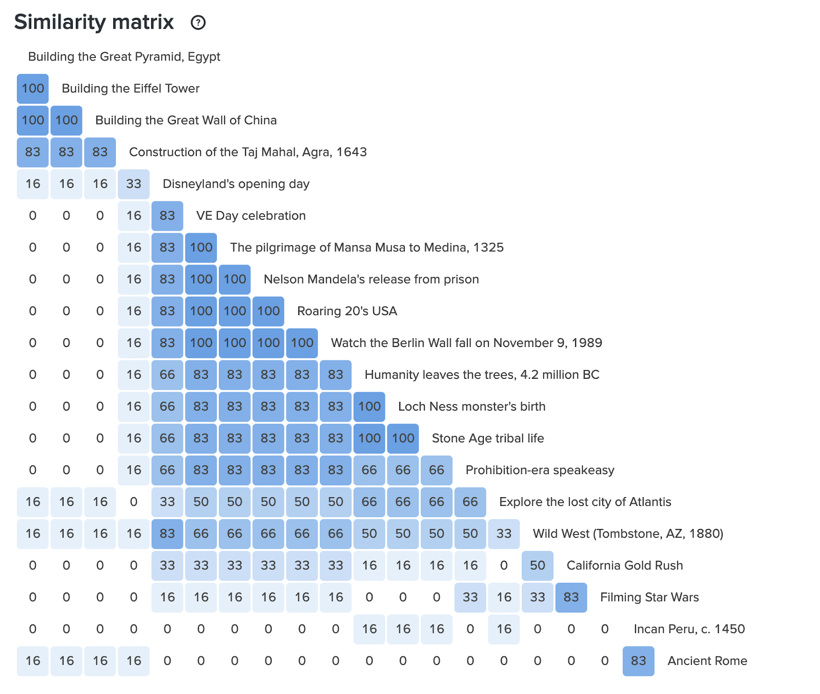
Standardization Grid and Similarity Matrix:
These two tables show a list of 20 cards with the category that the participants have selected and grouped. The least to the highest count is highlighted with the gradient color of blue. While each participant’s selection is different, the count on these tables shows which cards have been selected the most under a particular segment.
Card selections 20 cards
Participants 6
Duration 3:06 – 4:32 mins
Interaction Design
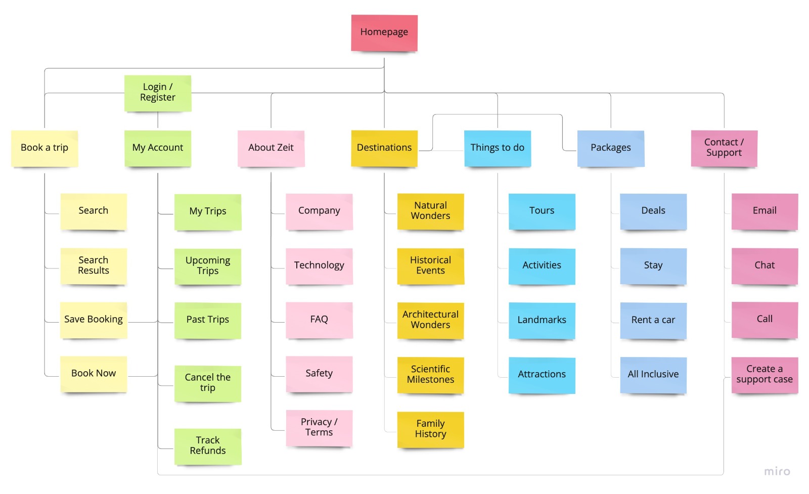
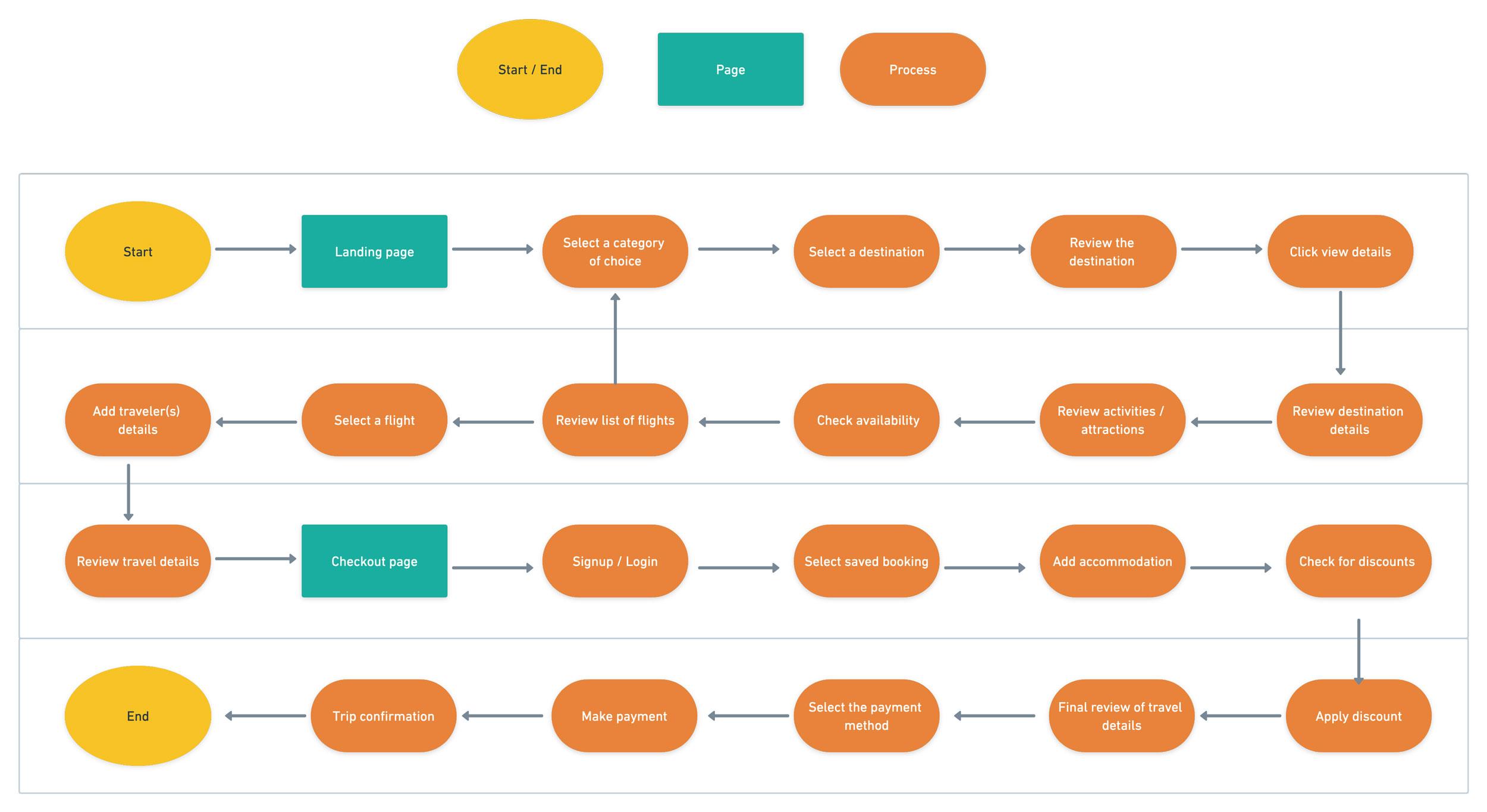
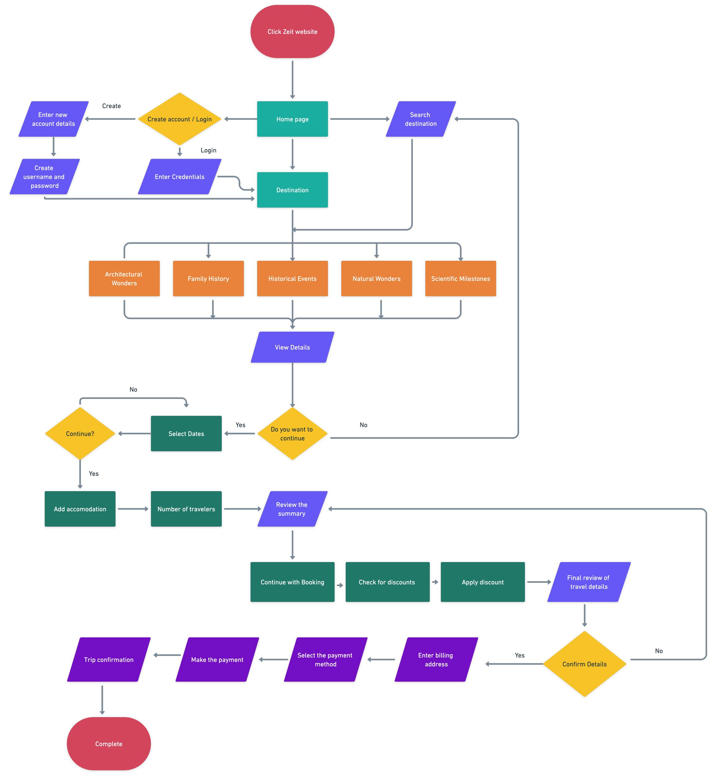
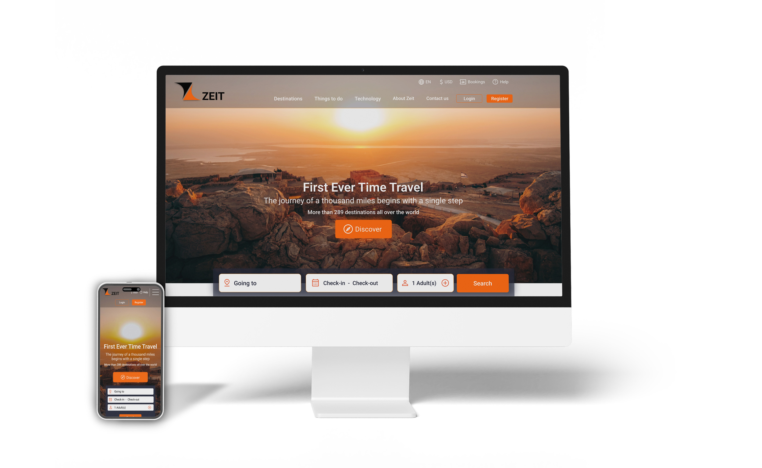
Based on the site map and persona the Task Flow, User Flow and Product Requirements were built as the guideline for future design. Since most of the travelers today do online research and mostly on smartphones, a responsive website is essential.
Design
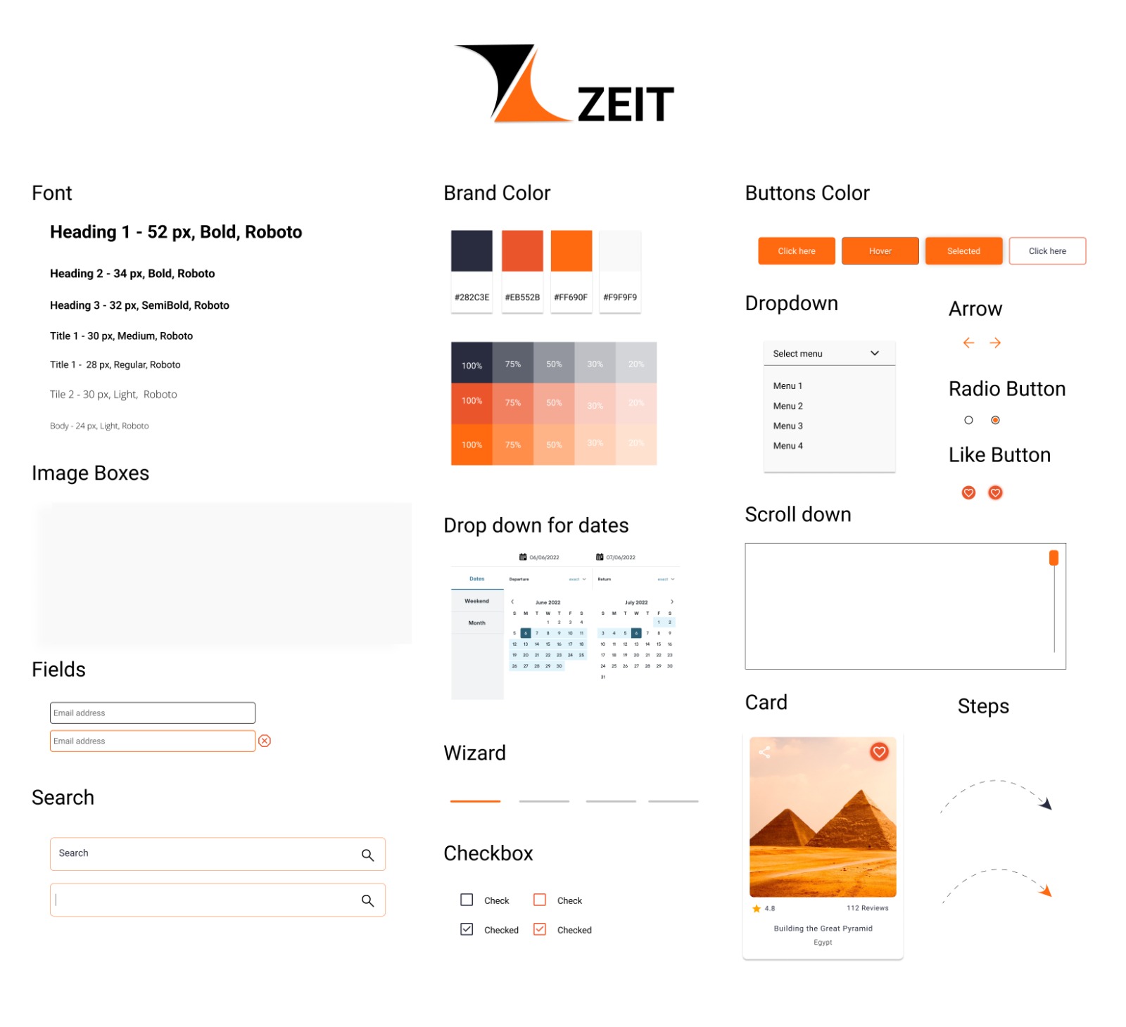
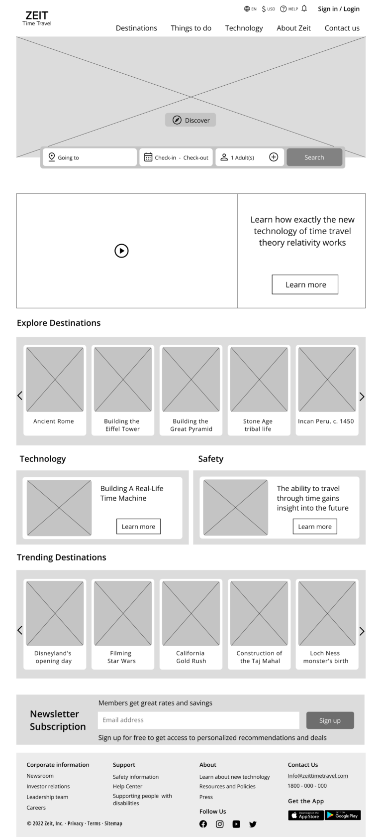
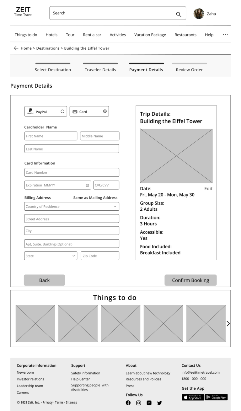
I started with a simple, scalable logo followed by inspiration from moodboarding and other similar brand sites. I kept my design concepts simple yet easy to use interface to increase the velocity of travel booking.
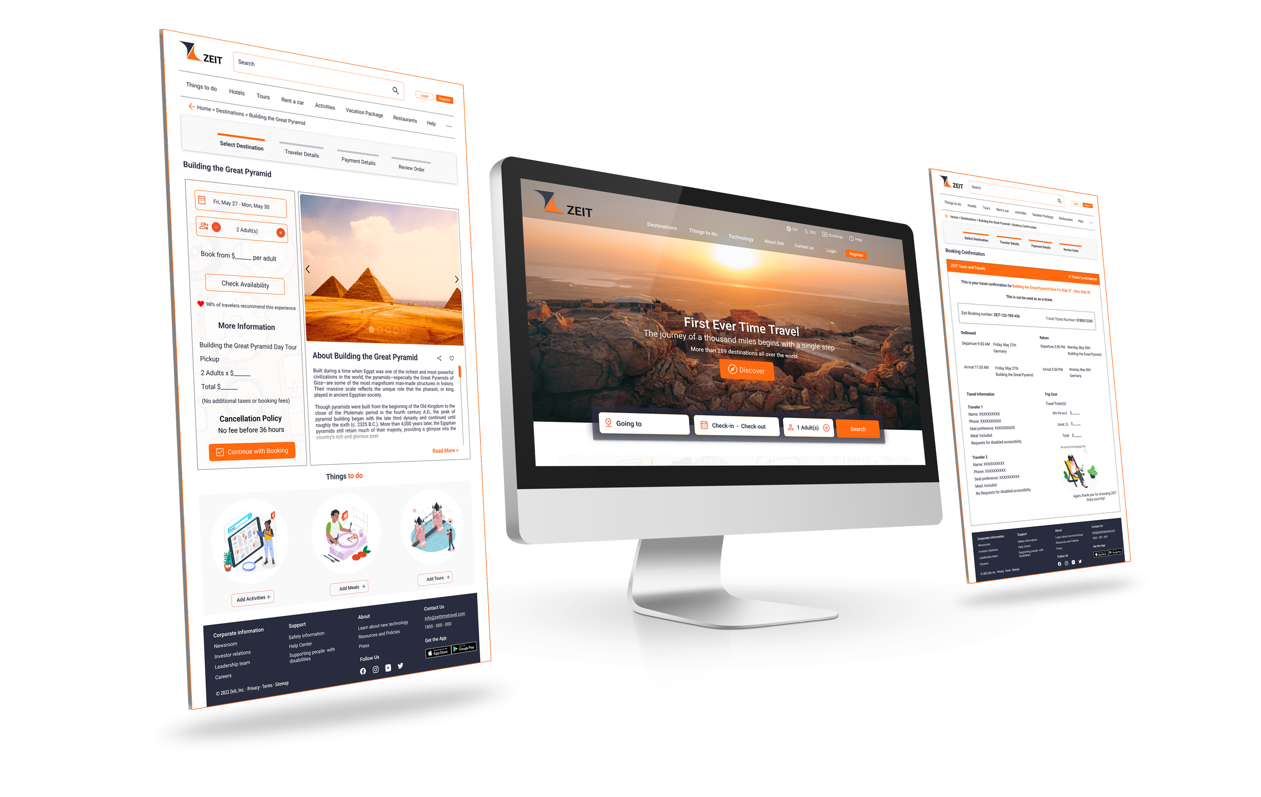
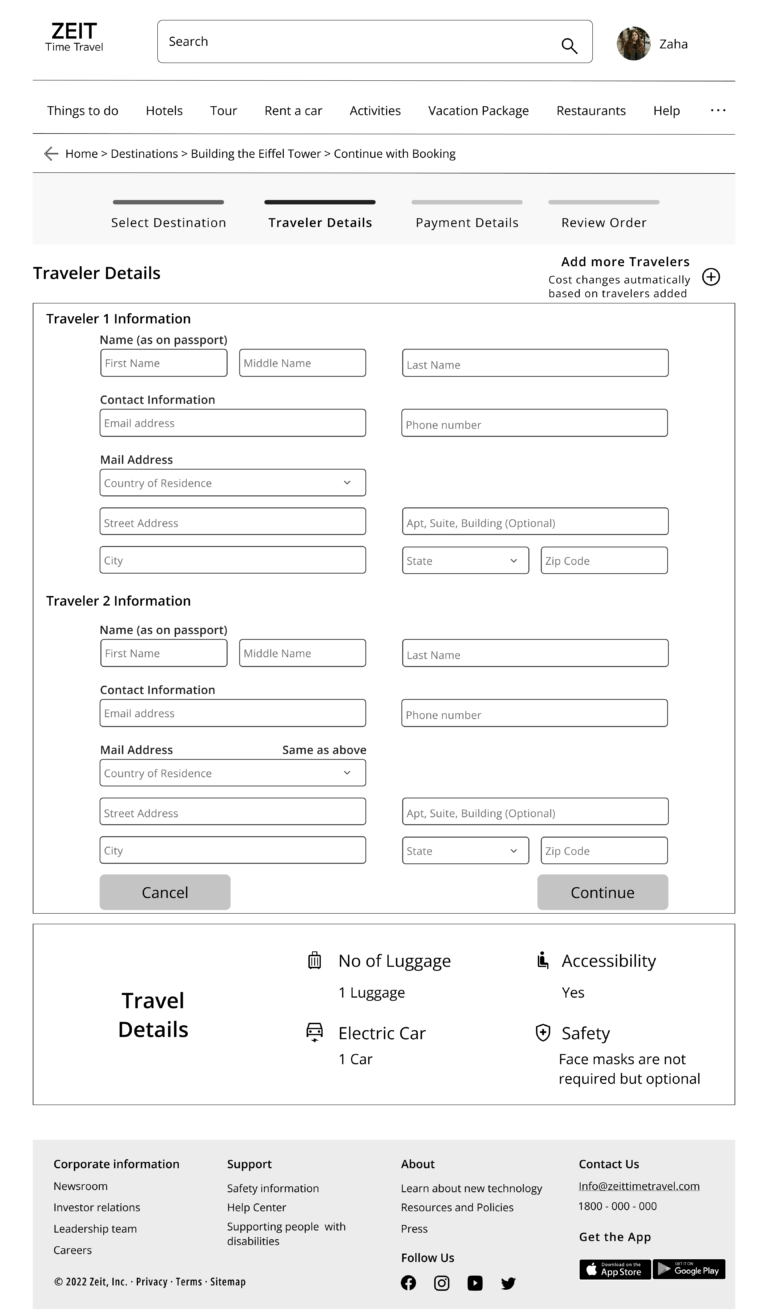
Based on the initial wireframes, I worked on a few iterations to work with sizing, proportions, and visual hierarchy. I kept user experience around booking in mind to design an eye-catching interface. After a few iterations, I was able to reaffirm the spirit of branding and alignment with proper design principles.
Test
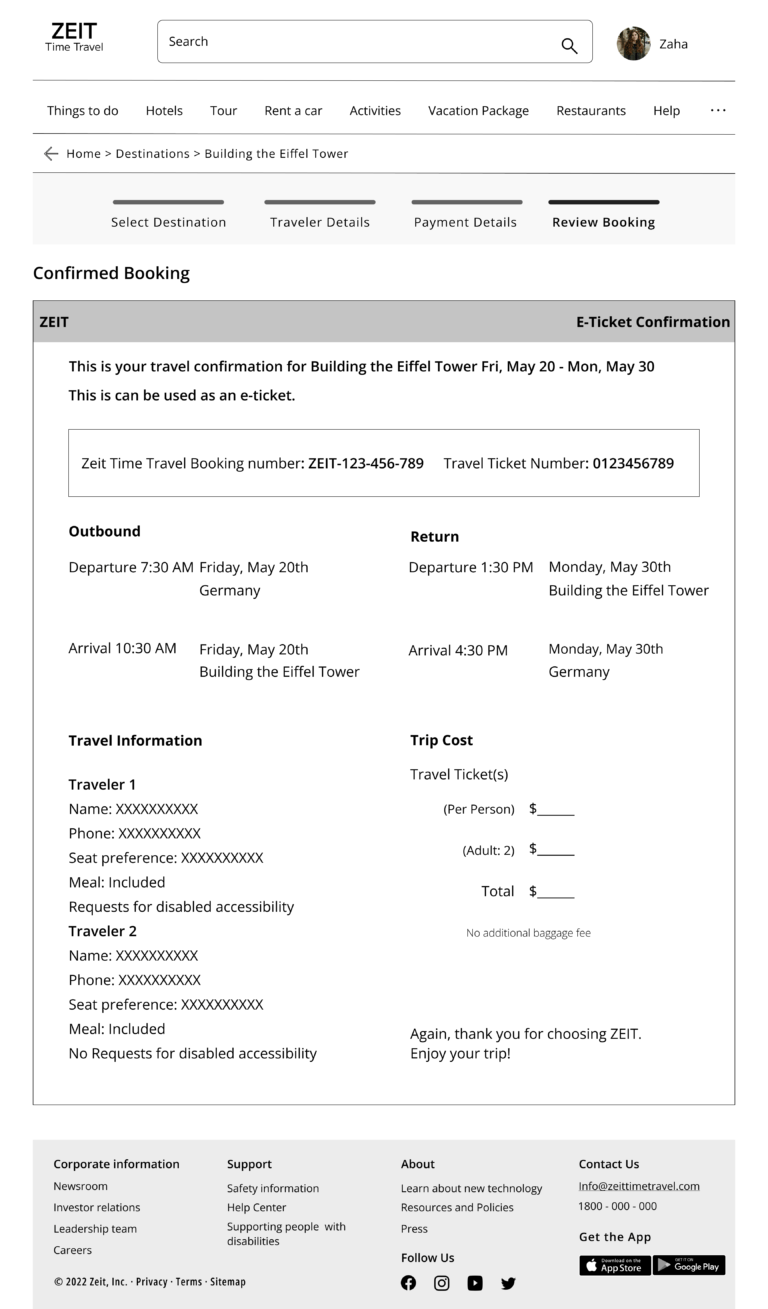
After that, I created a prototype with Adobe Figma and did user testing to validate if the features and the overall website functionality are easy to use. Further witnessed if users can complete the travel booking process.
Usability Test
Participants who are more interested in travel are between the ages of 25 – 45 years old and travel frequently.
Test Objectives
Ensure all the features make sense and are simple to use while booking travel. The users must complete the required tasks without facing confusion or frustration during the process.
Test Subject
High-fidelity website prototype from the home page to booking and confirmation of the time travel booking including payments. Validate if add-ons provides value to the users.
Test Methodology
One-on-one user testing by allowing them to navigate on their own using the website prototype and study the usability testing through a virtual or in-person meeting at their convenient time.
Test Goals:
The goal is to understand the main functionality of the website. That is to book a trip. The ease of use is achieved by navigating through the process. Keeping the brand information clear throughout the progress of booking. Observe and understand if the user is clear or confused. And if any frustration with the flow while booking their trip.
Task completion rate
100%
Task error-free rate
96%
Tasks Completed
Arrives at the homepage and explore destinations to book a trip and make the required payment
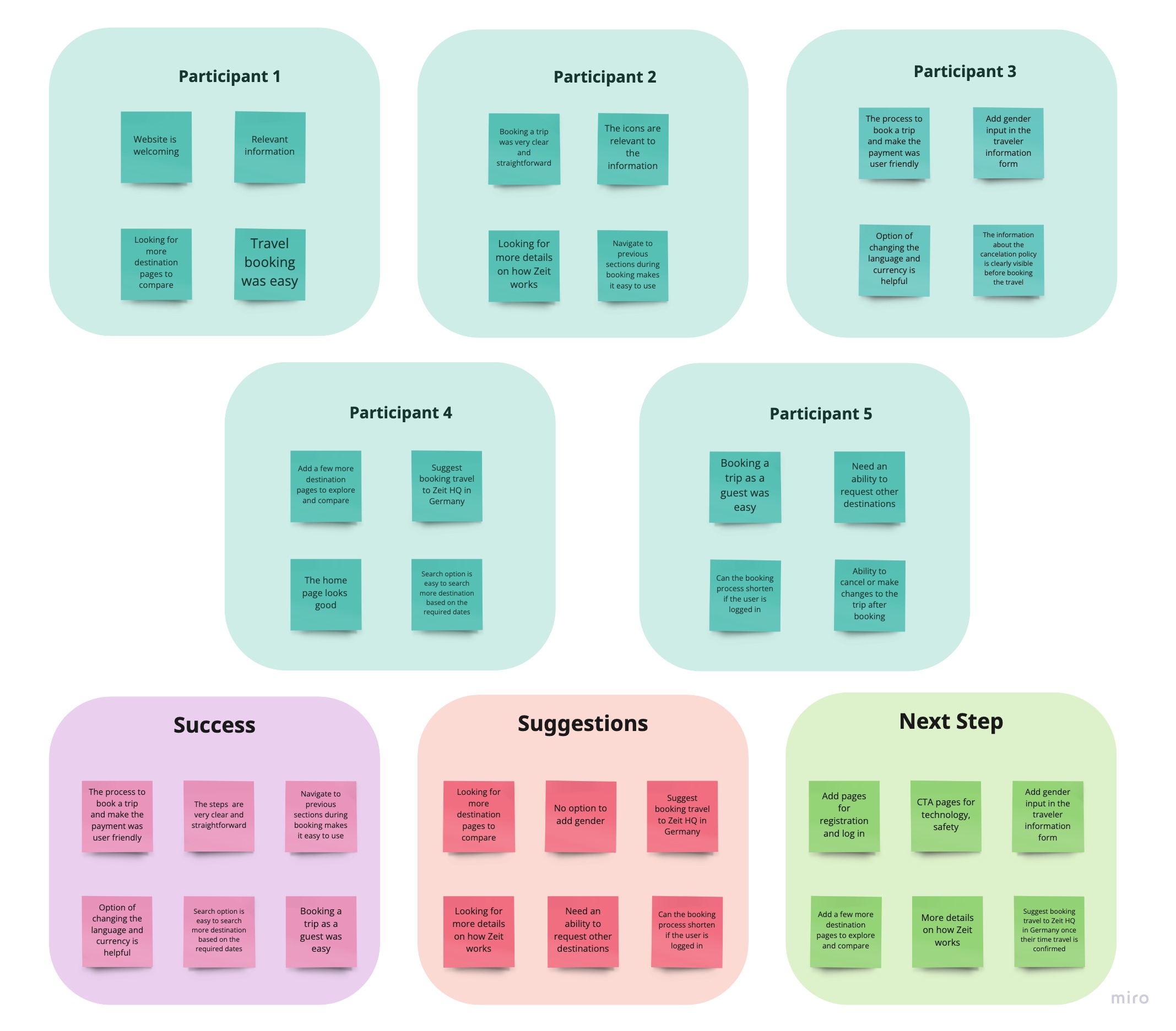
Key Findings
Observations
The participants are curious to learn how ZEIT technology works. The page navigation is easy and curated list of destinations and trending destinations are simple to use. The ability to review and edit travel dates along with the overall travel booking process for destinations provides a betters user experience. The trip add-ons such as stay, car rental, and the guided tour was a nice touch to elevate the experience.
Insights
The page has relevant information before confirming the booking. The steps are clear and easy to understand including cancellation terms. The booking process and making the payment was unmistakable. The CTA with supporting description text for each section is well placed and stands out. The ability to change the language and currency is a nice touch. The branding is used well throughout the site.
Opportunities
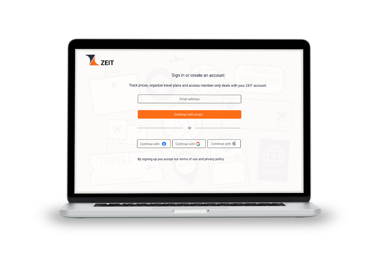
Add a few additional pages like registration and login. Add the CTA pages for technology, safety, and steps involved in the time travel. Gender input in the traveler information form during booking. Add a few more destination pages to explore and compare. Provide more details on how Zeit works. When a user receives booking confirmation for time travel, suggest travel booking to Zeit HQ in Germany.
Priority Revision
According to the key findings, adding a landing page for users to get daily updates regarding triggers, health reports and tips was important.
This landing page allows users to easily navigate to all critical notifications in one screen. Notifications such weather updates, exercise, medication, tips to manage asthma, etc.
