branding, mobile app
Google Aria
Google Aria
Managing asthma on-the-go
CASE STUDY
project overview
Google Aria is the most comfortable and sustainable wearable patch to manage asthma effectively. Google Aria needs a solution to work in a combination of wearable patch and companion mobile app that helps people manage their asthma. The solution also tracks medication and measures lung function without user intervention of logging the data manually.
- Focus : UX/Visual Design
- Duration : 6 Weeks
- Role : Sole Designer
- Project Type : Student Project
- Tools : Figma, Miro, Adobe XD
Research
This research began by understanding the problem to solve. Tracking and discovering symptoms leading to asthma flare-ups can be challenging and is typically not done in one place, using one product. The information can be disjointed, cluttered, and complex while using multiple apps.
Goals
- Understand the routine, experience, and frustrations of patients suffering from asthma
- Gather details about the types of asthma, asthma triggers, and how users manage it based on day-to-day activities
- Identify user pain points while using smart technology and wearable preferences
- Understand the methods of sharing details about health between caregivers, physicians, and patients including frequency of visits, medication, physical activities, triggers
- Identify users who can benefit the most from Google Aria patch and the companion mobile app
Since not a lot of content about smart wearable technology exists for asthma patients, so I looked into competitors and read threads written by doctors and users of similar apps via Google Search. Additionally, conducted a competitive analysis of similar products and came up with some brief provisional user personas based on the information discovered.
Methodologies
User Interviews
The use of wearable technology is changing the healthcare industry. People use fitness-based wearable tech to be active and track their daily activities. Google Aria can help patients with Asthma track, monitor, and manage their symptoms on the go using the smartphone app.
Focus Group
Collective data from the users using any other asthma app to understand their medication along with triggers like weather, pollution, and many others. In addition to managing asthma flare-ups on the go, these results help with tracking and sharing with physicians and caretakers.
Survey
The survey will be a collective analysis of different asthma apps and their features. We need to understand how users interact with wearables. The survey will allow us to identify features that will be easy to use by recording and sharing health details with the caretaker or physicians.
Participants
- People who would need immediate help with managing asthma by tracking their health daily
- People who prefer monitoring and logging their asthma-related symptoms regularly
- People who use inhalers/pumps while traveling
- People suffering from asthma who go for a routine check-up with caretakers or physicians
- People who want to determine nearby factors in the air that trigger asthma symptoms
Assumptions/Risks
- Do users have access to a device or mobile app to keep track of their asthma records?
- Does the current device and app helps them and alert them before asthma related symptoms flares up?
- Do self-management programs help in the routine management of patients with asthma?
- Do they get alerts for any medical emergency?
- Does the app show any significant improvements in asthma-related symptoms after using a smartphone app as a tracking mechanism?
Competitors Research
The secondary research is based on the competitive brands that include asthma management platforms and wearables along with ease of use, affordability, service, capability, solution solving, technology, overall success, feasibility, reading articles relevant to the industry, and comparing features between the leading platforms.

STRENGTHS
- Sensor attach to the inhalers to track medication use which sends reminders to take dosage on time
- A smartphone app helps you learn what causes flare-ups and tracks symptoms
- Sharing reports with doctor helps them learn about their patients’ progress
WEAKNESSES
- Facing the challenge of generating mass adoption
- Must maintain its promise of patient privacy
- Requires constant rebooting of the app

STRENGTHS
- Patients to log their asthma activities, medications, and triggers in a diary
- A color data graph that users can share with their doctors
- Every saved asthma data entry is securely encrypted and transmitted
WEAKNESSES
- Need to feed more information while not well
- It has software bugs and needs frequent updates
- Adding and removing medications involves editing the whole action plan

STRENGTHS
- The first digital inhaler with built-in sensors that detect when the inhaler is used, and measure respiratory flow
- There is an electronic module built into the top of the inhaler that records and stores information
- The inhaler data is sent to the mobile app using wireless technology so patients can review data over and share the reports with their caregivers and health care professionals
WEAKNESSES
- Sensors can’t track the health of the person
- Need to scan the bar code when a new inhaler is used
- Only 3 metrics can be chosen for the daily updates

STRENGTHS
- Pre-installed sensors which wrap around patient inhalers and provide real-time feedback to patients via the Hailie app
- Solution is a cloud-based platform which captures medication use data from FDA-cleared systems
- Reduction in severity and frequency of exacerbations
- Award Winning Technology and widely adopted
WEAKNESSES
- The Hailie sensor only works with a valid Hailie app solution subscription
- The device continually loses its sync
- Subscription is too expensive

STRENGTHS
- A smart device on the inhaler gets data and provide accurate treatment based on precise data
- It is easy to create an account with the app
- All the data is generated in the form of a report and can be easily shared with the doctor
- Patients receive reminders when it is time to take a particular medication
WEAKNESSES
- The app closes every time while logging medicine usage
- No option to change from Celsius to Fahrenheit
- Recent updates has made it hard to remove accidental input of dosages
Define
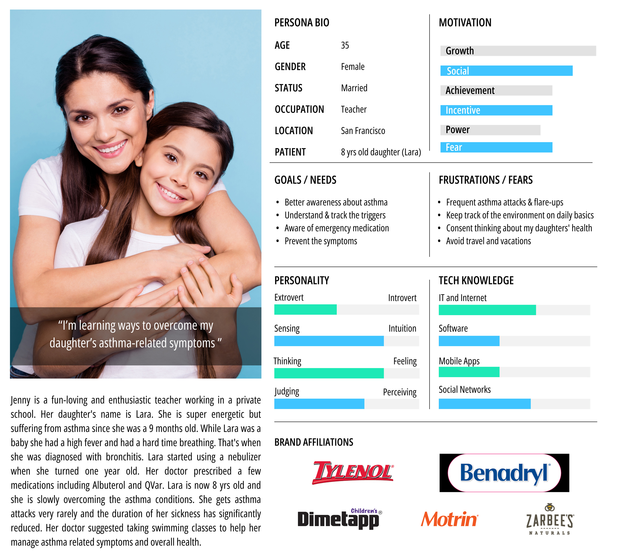
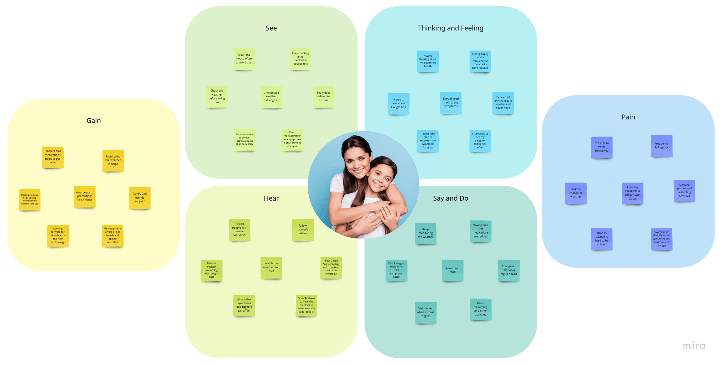
Drawing from the research data helped to create a user persona encompassing everything we heard from real users in interviews and survey responses. By referring to this persona during the design process, it will be helpful to stay focused on user goals and avoid or solve pre-existing problems.
Participants: 3
Interview Duration: 30 – 45 mins
Goal: To learn and understand how asthma affects day to day lifestyle
Research Debrief
Observations | Participant 1 Gender: Female Age: 35 Occupation: Teacher Patient: 8 yrs old daughter | Participant 2 Gender: Female Age: 28 Occupation: Fitness trainer Patient: 78 yrs old grandma | Participant 3 Gender: Male Age: 26 Occupation: Tech Patient: Self |
Preventive measures | Knowledgeable about diet and activities | Awareness about surrounding and activities | Activities and diet |
Lifestyle Routine | Active | Sedantry | Active |
Tracking asthma attacks | No Records | No Records | On Mobile |
Treatments | Very knowledgeable and familiar with the immediate measures | Mostly familiar on diet and medication to be taken | Familiar and have a personal action plan |
Daily health updates and notifications | On the mobile | On demand | On the mobile |
Sign up for updates on Google Aria | Interested to learn more once Aria is officially available for public use | Interested to use after Aria receives FDA approval | Interested to sign up for beta/clinical trial |
Research Insights
- All participants shared their experiences with asthma, including precautions taken to manage it
- Most of them were not aware of tracking the symptoms via the mobile app on the go
- They regularly use meditation(s) prescribed by their doctors/caretakers
- Without any tracking capability, it is hard to record and understand the case of wheezing, frequency, or weather that could trigger asthma attacks
- Some of them are doing guesswork about what triggers and flares their asthma
- They are aware of what measures to be taken when the symptoms show up
- They keep monitoring their vitals regularly to manage symptoms at the early stages
- Younger participants having an active lifestyle can avoid frequent episodes
- People who use the app, find it difficult to enter all the data by themselves especially when they are not feeling well
- All participants are looking forward to using new wearable technology which can alert them and prevent the severity of the sickness, especially using a mobile app that can be used on the go
Feature Roadmap
Must Have
- Profile/Personal Information
- Medication/ Prescription
- Medical History
- Health Vitals
- Breathing Graph
- Heart Rate/ Graph
- Respiratory
- Push Notification
- Pollen Count
- Air Quality
- Reminders
- Report Sharing
- Logbook
- Emergency Support
- Exercise Log
- Weekly Summary
Nice to have
- Learn about Asthma
- Nutrition
- Sleep
Surprising and delightful
- Meditation
- History Of Asthma attacks
Can come later
- Lab Results
- Immunization Records
Card Sorting
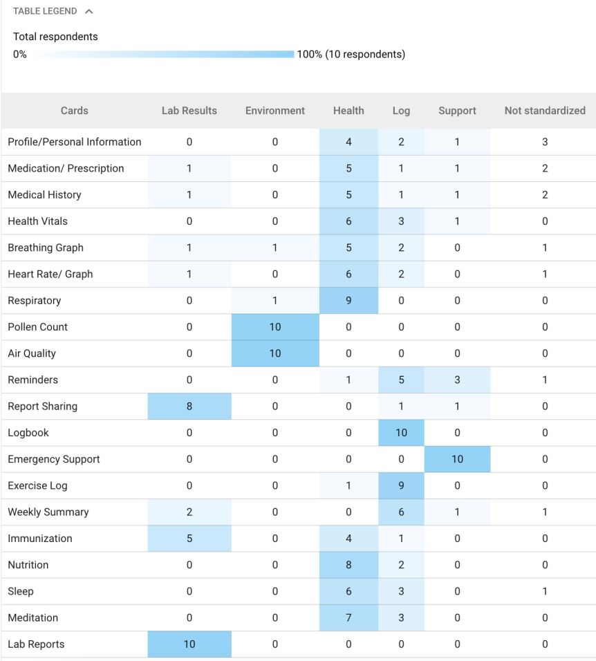
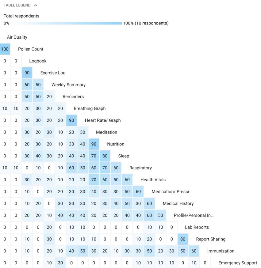
Standardization Grid and Similarity Matrix:
These two tables show a list of 20 cards with the category that the participants have selected and grouped. The least to the highest count is highlighted with the gradient color of blue. While each participant’s selection is different, the count on these tables shows which cards have been selected the most under a particular segment.
Card selections
20 cards
Participants
10
Duration
3:06 – 4:32 mins
Interaction Design
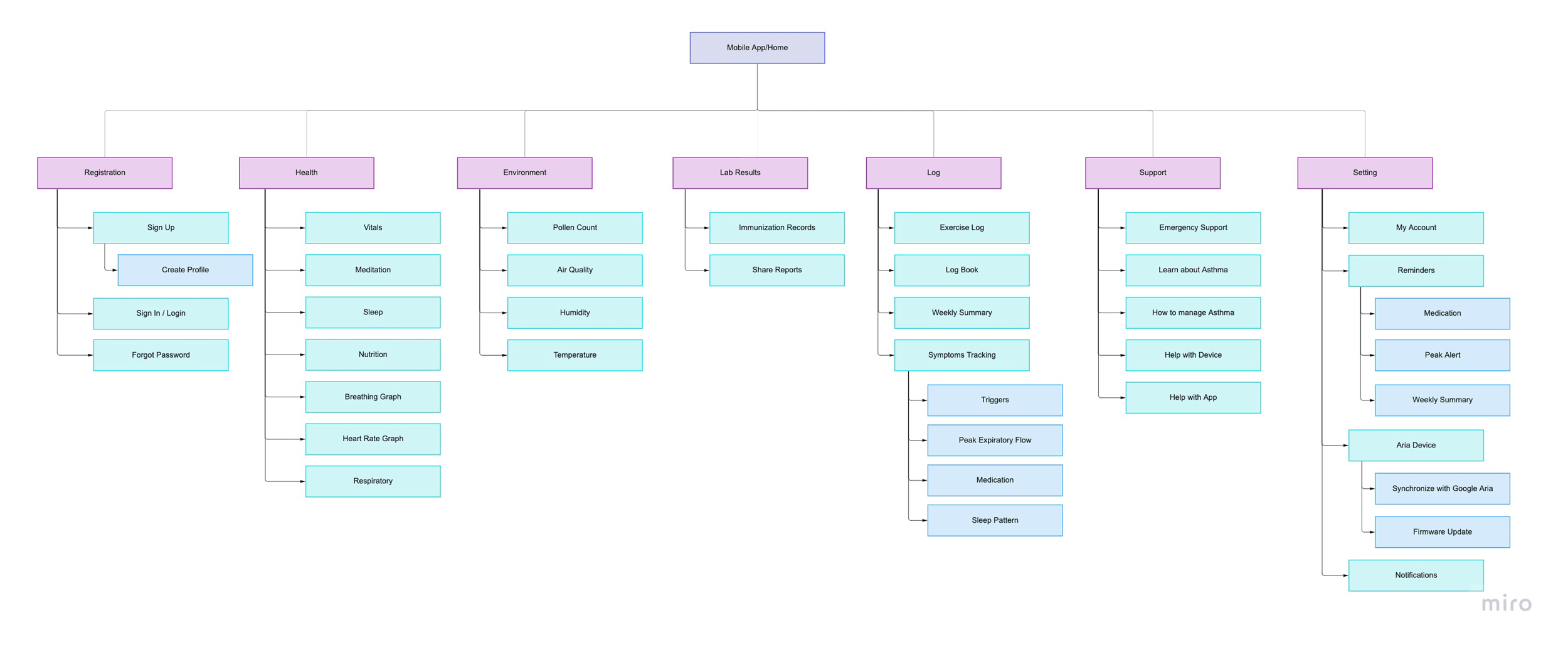
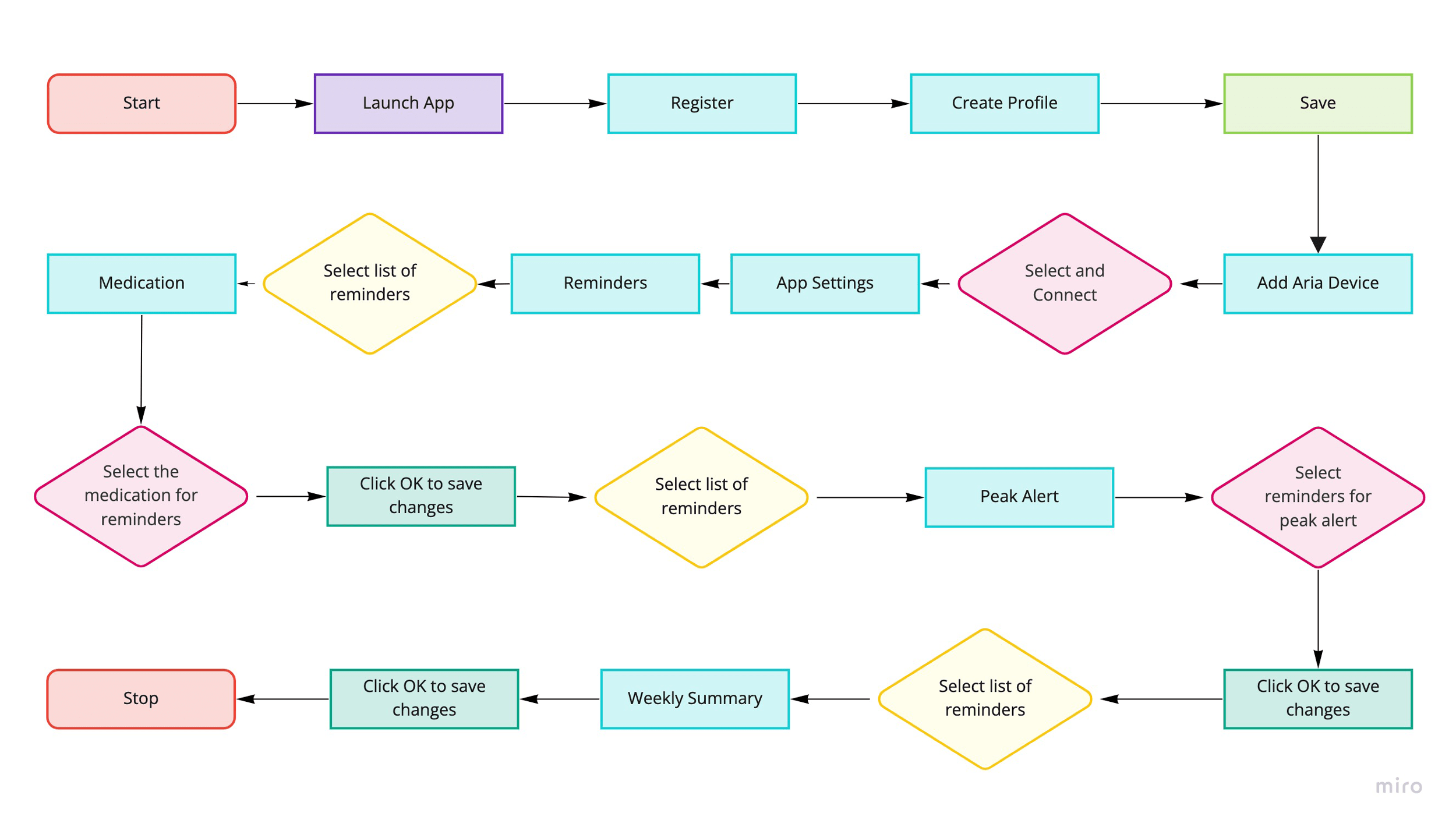
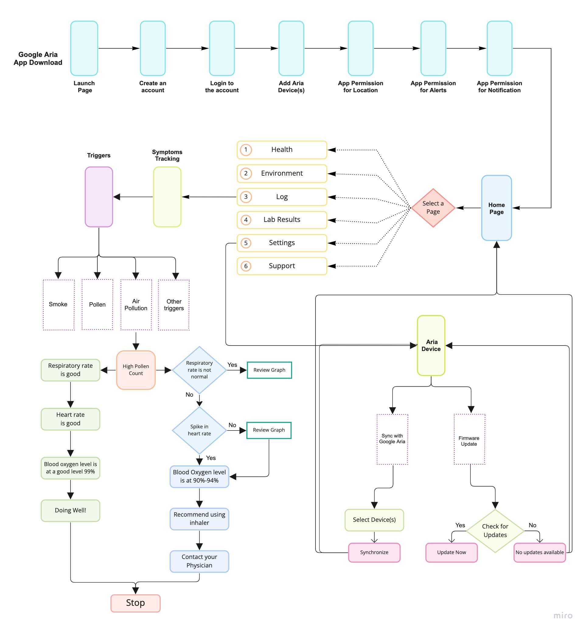
Based on the site map and interaction with personas the Task Flow, User Flow, and Product Requirements were built as the guidelines for future design.
High Fidelity Prototype
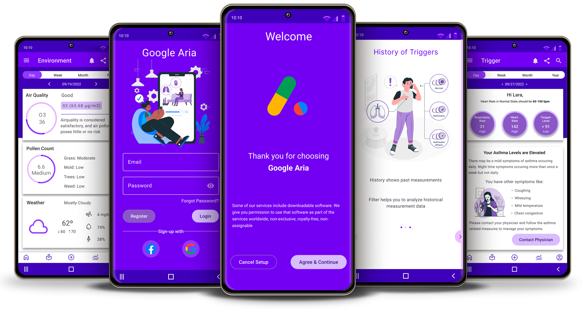
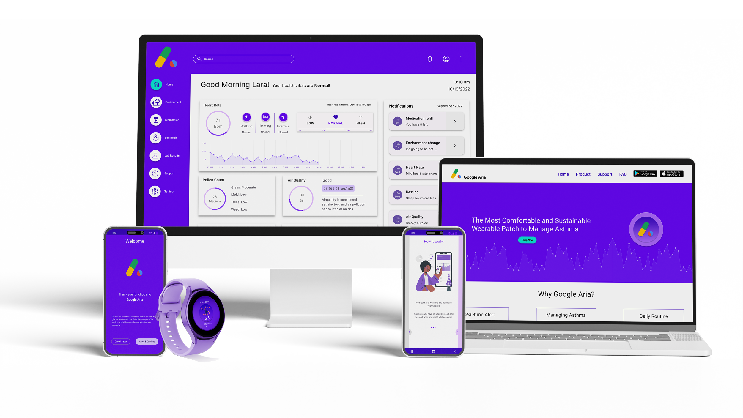
Based on the initial wireframes, I worked on multiple iterations to work with sizing, proportions, and visual hierarchy. I kept the user experience as the focus of designing an eye-catching interface. After a few iterations, I was able to reaffirm the spirit of branding and alignment with design principles.

A responsive landing page that introduces the Google Aria wearable patch to end users along with getting started guide and support.
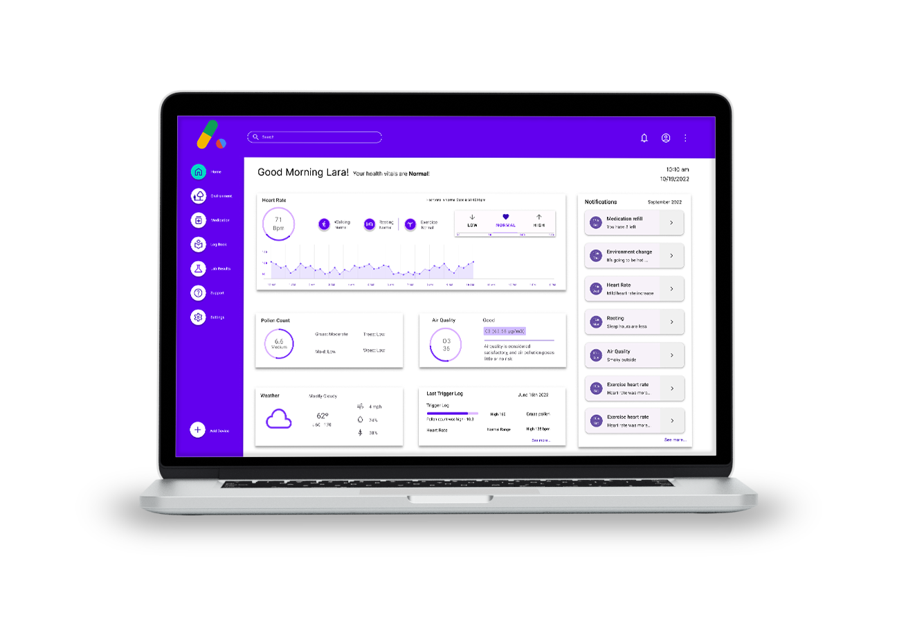
A desktop application that provides an overview of various health and environmental data collected by the wearable patch and the mobile app to help users manage their asthma every day.
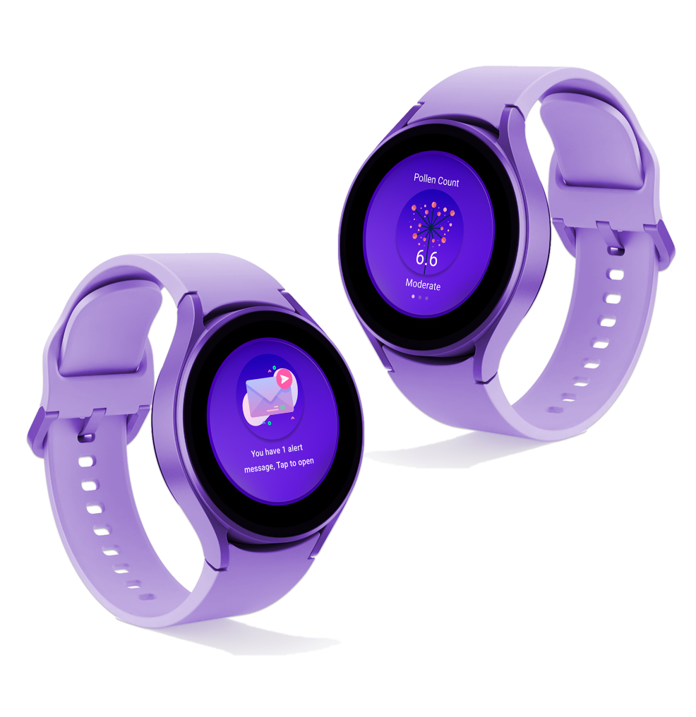
A companion smartwatch app that works with Android based smartphone app and Google Aria. Get real-time actionable notification to manage asthma on-the-go.
Test
After creating a prototype with Adobe Figma, I performed user testing with the help of users to validate if the features and overall functionality made sense to the end users. I further witnessed if users can complete various tasks in the mobile app.
Usability Test
The participants are caretakers or care seekers in an age group between 5 to 80 years old and who have encountered asthma.
Test Objectives
Ensure all the features make sense to the participants and are simple to use. The users must complete the required tasks without facing confusion or frustration during the process.
Test Subject
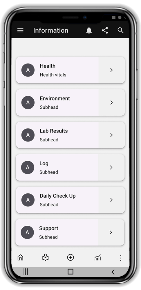
Mobile app prototype from registration, the home page, software updates and look for various information such as health conditions, alerts, and record asthma triggers.
Test Methodology
Setup one-on-one user testing by allowing them to navigate on their own using the mobile app prototype and study the usability testing through a virtual or in-person meeting.
Test Goals:
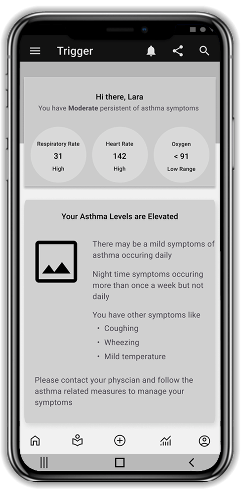
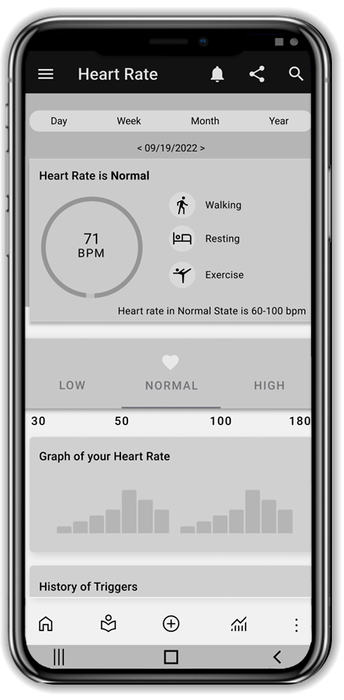
The goal is to understand the main functionality of asthma triggers based on environmental changes and health vitals. The patch connected to asthma patients gets health information such as daily heart rate, lung function, respiratory rate, oxygen levels, etc. Keeping Google’s brand constraints in mind while creating the mobile app. Observe if the user understands the flow of the functionality. Record any frustrations encountered while the navigation flow of getting information and alert if there is a trigger.
Task completion rate
100%
Task error-free rate
94%
Tasks Completed
Registration and Login
Setup and Alerts
Recent trigger alert
Medications
Key Findings
Observations
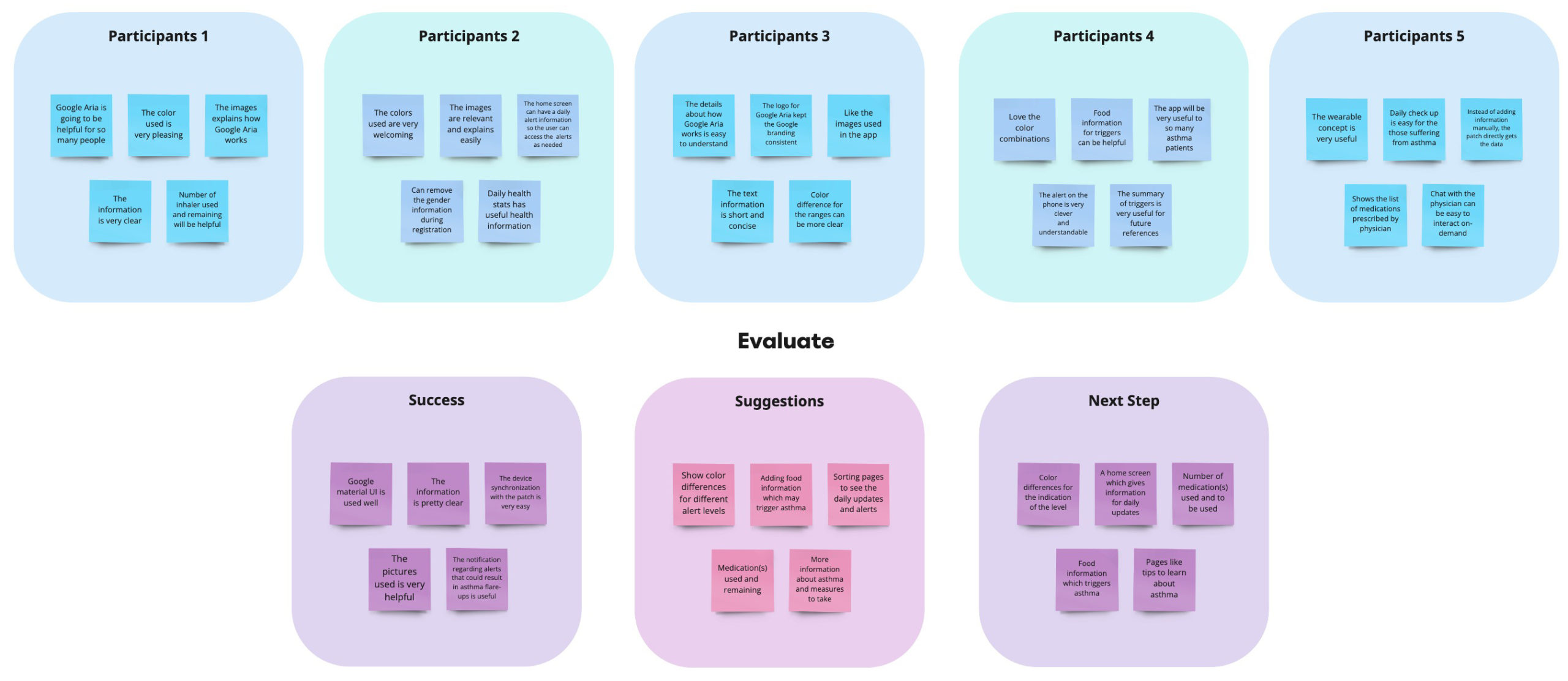
Participants are curious yet excited about the new wearable concept. They could log in and register to the Google Aria app easily. They get their daily health and environment updates. During emergencies, they received an alert message when health vitals or the surrounding environment changed.
Insights
The mobile app and desktop app is user friendly. The overall branding align with rest of Google’s brand guidelines. The CTA for each element is well placed and stands out for interaction including text descriptions. The notification regarding alerts that may result in asthma flare-ups is a nice touch.
Opportunities
Add pages like daily tips and learn about asthma triggers. Add cards sorting like feature to get personalized daily updates. Ability to review medication, request refills and food information may add value. Use of various colors to indicate the differences of the levels may enhance the overall user experience.
Priority Revision
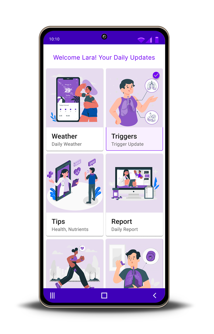
According to the key findings, adding a landing page for users to get daily updates regarding triggers, health reports and tips was important.
This landing page allows users to easily navigate to all critical notifications in one screen. Notifications such weather updates, exercise, medication, tips to manage asthma, etc.
